In this article+
01
Let one pattern be the first thing you see
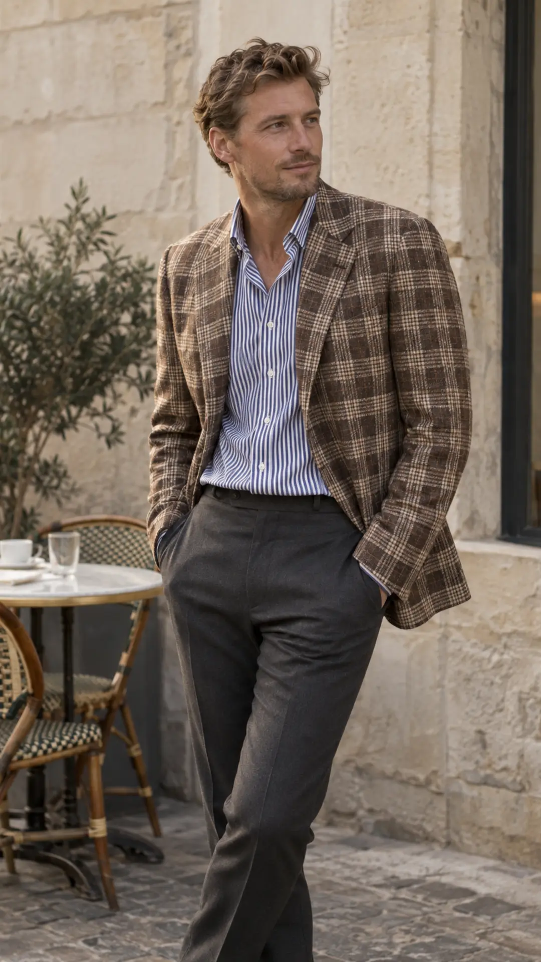
Choose the garment that carries the outfit—a checked jacket, striped shirt or patterned knit—and reduce the intensity of everything around it. A second pattern should be discovered after the first rather than arriving at the same volume. If your eye jumps continuously between two garments, neither is leading and the outfit needs a quieter partner.
02
THE TWO-PATTERN FORMULA
Give every pattern a different job.
Pattern mixing is a hierarchy problem, not a prohibition. Start with two patterns; add a third only when the first two already feel quiet.
| Lead | Support | Anchor | Why it works |
|---|---|---|---|
| Broad checked jacket | Fine striped shirt | Plain trouser | Different scale; solid lower half |
| Bengal-stripe shirt | Small woven tie | Plain suit | Shared colour; suit creates rest |
| Striped knit | Soft checked coat | Plain denim | Different texture and distance |
| Patterned scarf | Subtle herringbone jacket | Plain shirt | Accessory leads; shirt separates |
03
Change the scale, not merely the motif
Two stripes or two checks can work when their spacing is clearly different. A broad windowpane beside a fine shirt stripe is easier to separate than two medium checks. The same principle applies across different motifs: a dense herringbone and tiny gingham can blur together at a distance. Step back from the mirror until the smaller pattern behaves almost like texture.
04
Keep one large solid anchor
A plain trouser, coat, shirt or knit gives the eye somewhere to rest. In tailored clothing, the shirt-jacket-tie triangle is a useful check: if two elements are patterned, keep the third solid. In casual clothing, let plain denim, chinos or an unpatterned overshirt perform the same role. The solid piece should be substantial enough to calm the whole composition.
05
Repeat one colour between the patterns
The patterns do not need matching palettes, but one shared colour makes the relationship visible. A navy line in a shirt can connect with a navy ground in a jacket; a cream stripe can repeat the trouser. Avoid trying to match every shade exactly. One repeated note is enough, while the remaining colours can sit at different depths and temperatures.
06
Separate similar patterns with texture
When scale alone is not enough, change the surface. A crisp striped poplin shirt can sit beneath a soft houndstooth coat because the fabrics catch light differently. A printed silk pattern and brushed wool also remain distinct. Several smooth, high-contrast patterns are louder because their edges compete in the same way; tactile variation gives each garment its own register.
07
Match the patterns’ level of formality
A pinstripe suit and restrained woven tie share a tailored language. A rugby stripe and plaid overshirt share a casual one. Mixing formal and casual patterns can be excellent, but the cut and footwear need to explain the shift. If the combination feels like two outfits colliding, simplify the shoe and repeat one fabric weight or colour elsewhere.
08
Use the photograph test
Take a full-length photograph in normal light, then view it small. The silhouette should read first, the leading pattern second and the supporting pattern only after that. If the patterns merge, increase the difference in scale. If both shout, replace one with a solid. This test is more reliable than studying cloth from ten centimetres away in the fitting room.
SOURCES & FURTHER READINGThe references behind this guide+
- Permanent Style — Combining pattern and colour in shirts and ties
- Permanent Style — Combining colours and patterns
- Put This On — A guide to summer shirts
- QWD guide — Texture before colour
QWD applies these references as a practical menswear baseline. Garment design, body proportions and intended styling can justify a different choice.